
Optimize Your Patch Text for Maximum Impact
Choosing the right font and text size is the key to patch success
Custom patches are a great way to make your brand stand out. Whether you’re promoting your business, nonprofit organization, band or team, patches let people know who you are and what you’re about.
Designing patches isn’t hard, but if you want to achieve maximum exposure and impact, it’s important to optimize your design. Text size, color and font all are critical factors to make sure your intended audience receives your message.
Text Design Considerations
Start with what you want to say. Your message will in part determine the size of your patch, the type of patch and color choices.
Keep It Simple

In general, it’s best to keep your patches simple. More art, less text is generally the way to go. Having said that, your design almost certainly will require text of some sort for your message.
Size Matters for Both Patch and Text
Obviously, the bigger your patch, the more room you’ll have for text. However, that doesn’t give you carte blanche to fill the space with words. On the other hand, too much space can reduce the effectiveness of your message as well. The key is to keep both patch and text sizes proportional.
Getting that proportion right affects both the attractiveness of your patch and the legibility of your message. You want your logo, name or message to be what people see and recognize.
Consider Text Size
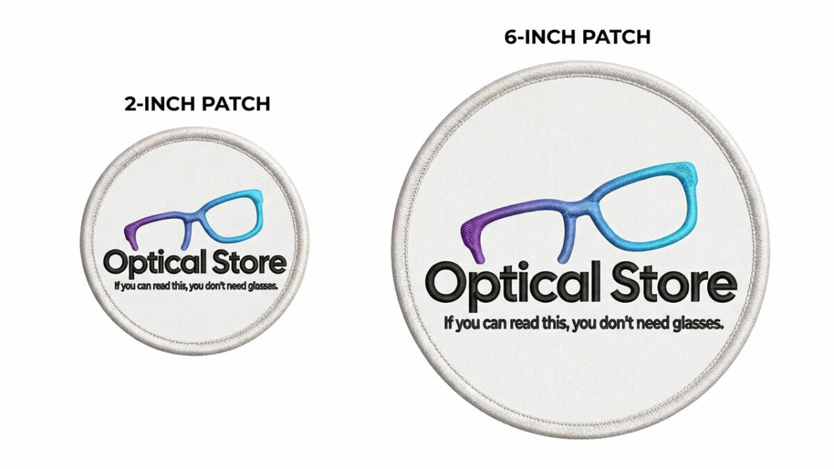
Start with text size. Think about what you need to include on the patch. Too many words on a small patch will, at best, look messy and crowded. At worst, it won’t be readable, defeating the purpose of your patch completely.
At Patches4Less, we make patches in a wide range of sizes, ranging from two inches for basic uniform patches up to 15 inches for jacket back patches.
Customers sometimes ask us for patches smaller than two inches. Sometimes, we’re able to accommodate them. In many cases though, the basic physical limits of the embroidery process prevent us from doing so.
You Can’t Break the Laws of Physics
Embroidery thread has a specific minimum physical size. There’s just no way to avoid that. Woven patches are the same. They use a smaller thread, so they’re able to include more detail into a smaller space than embroidery. But ultimately, there is an unavoidable physical limit to how small your design can be and still be legible.
For a general rule of thumb, your text should be at least a quarter-inch in height. That’s the equivalent of 14 points in a standard block font. (More on fonts in a bit.)
If You Must Have Small Text
If your design absolutely requires small text, consider an alternative to embroidered or woven patches. PVC patches, because they don’t require stitching, can have smaller, more intricate lettering that’s still readable. That can also give you more room on the patch for logos and other art.
The Flip Side: Text That’s Too Big
It’s a lot less likely, but it is possible to have fonts that are too large. A font that’s too big for the overall patch size can overwhelm the integrated look of your design and limit your art options. Keep everything balanced. If a certain text size just doesn’t look right for a given patch size, go for a larger or smaller patch as needed. Or if the text is too small and you can’t change the patch size, you might need to simplify your message.
The Next Step in Legibility: Fonts
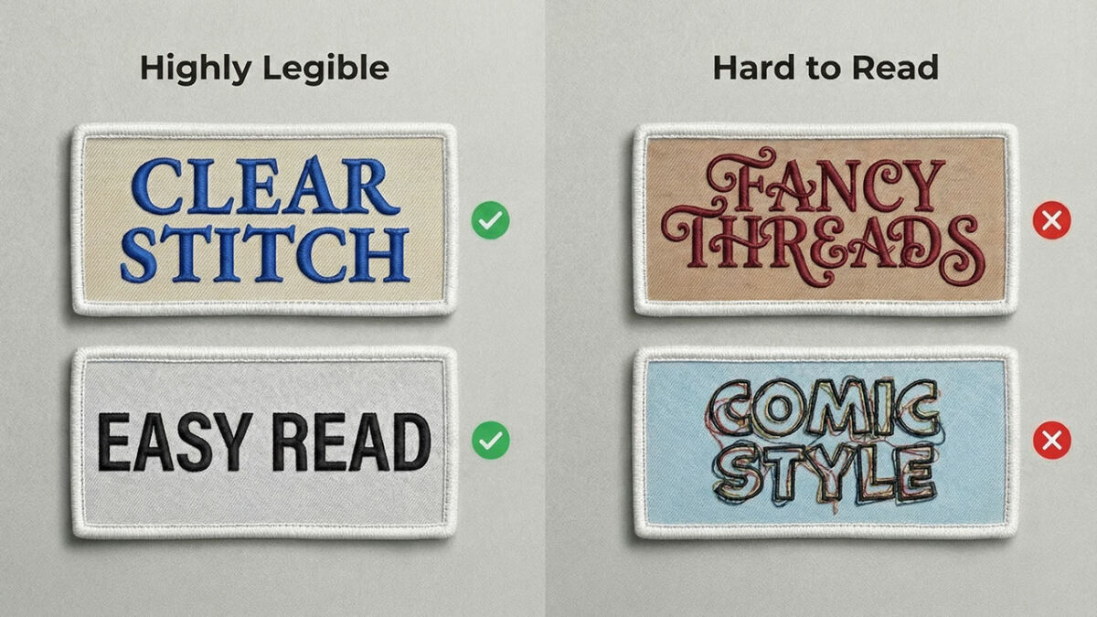
When you’re designing your patches, remember, maximum legibility is your goal. If your intended audience can’t read your patches, your message is lost. That’s why it’s important to choose the right font(s) for your design.
A good font is one that conveys your message clearly and attractively. A bad font is one that’s hard to read or is inappropriate for your message.
Fonts That Don't Work
Some fonts don’t work well for patches. Take a look at the fonts on the right in the above picture. Generally, any font that features excessive flourishes, odd letter shapes or a fading appearance is not a good choice for patches. Fonts that offer a whimsical appearance (think: Papyrus) are also hard to read quickly. Fonts that offer a comical or childlike style such as Comic Sans are almost always a no-go.
There are exceptions, of course. Children’s charities for example frequently use Comic Sans and similar fonts. But in general, it’s one to avoid.
Fonts That Work
To maximize the readability of your patches, choose fonts with a simple, clean look. The smaller your text needs to be, the simpler the font. Garamond, for example, is a no-frills classic font that’s remains legible at just about any size. That's the one in the top left above. Nothing unnecessary to distract from the basic letter. No swirls, curls, “cute” flourishes or fades. Just an attractive, easily legible design.
Keep Your Fonts Complementary
You can use more than one font in your design, as long as they create a united look. When your design features multiple fonts, be sure they coordinate well together. Clashing fonts compete visually with each other, creating a messy look that hinders readability. That reduces the effectiveness of your design. The goal is to have every aspect of your design, including art, colors and text, form an integrated, effective design.
A Word About Color
Color is also an important consideration when you’re talking about patch legibility. It’s critical to ensure your choice of text color is readable against the background colors of your patch.
If you’re reproducing existing team, school or company logos, match the specific color to your patch design. Your logo should stand out clearly, with legible text and a clean design.
Count on Us
Finding the best design for your custom patches isn’t hard. Balancing patch size, font size, color and style is easy with just a little bit of planning. And we’re always here to help you work it out. At Patches4Less.com, we’ve been designing patches for more than 20 years. We’ll be glad to help you find the perfect patch size, fonts, colors and text size to make your patches the most effective they can be.
Want to find out more? Give us a call, toll free at (866) 847-2824, or email us. We’re here to answer any questions you might have about optimizing your patch design.
If you already have a design in mind, fill out our no-obligation free quote form, and we’ll send you a free digital proof of your design. You can revise it as much as you want before production begins to ensure your patches will look exactly the way you expect them to.
When you’re ready to order custom patches, Patches4Less.com is your dependable source for outstanding quality, great prices and legendary customer service. Call or email us today!
