
The Language of Colors: Choosing the Right Palette for Your Patch
The colors you choose are a vital part of custom patch design. It's easy to select colors to make your patches stand out
In the world of patch design, color is a visual choice that speaks volumes. Every hue and shade carries its own meaning, setting the tone and conveying emotions.
Color is an option for patches that can transform a simple design into a powerful symbol. Whether representing a team, commemorating an event, or supporting a cause, your chosen colors help convey your message.
Understanding the meanings behind colors allows you to craft a patch that resonates with your audience on a deeper level. Below, we explore the nuances that different colors bring to the table.
Understanding Color Psychology
Color psychology is the exploration of how colors impact human emotions and perceptions. By understanding this, you can thoughtfully select colors that amplify the intended message of your patch.
The Influence of Color
In patch design, color psychology becomes an art form. Colors can influence human emotions and shape perceptions. Understanding this influence enables you to strategically choose colors that align with the purpose and meaning of your custom embroidered patch.
Primary Colors: Red, Blue, and Yellow
In the primary spectrum of color, red, blue, and yellow evoke various emotions and perceptions. Red embodies passion and energy, making it ideal for patches representing intensity, love, or vigor.
For example, in sports team emblems, red embodies intensity, conveying the determination and spirit of competition. In symbols of love, such as heart-shaped patches, red represents deep affection and romance. In patches for fitness communities, red signifies vigor, reflecting the lively and energetic nature of an active lifestyle.
Blue is versatile and calming, symbolizing trust while conveying professionalism for corporate patches or tranquility for recreational events.
Yellow radiates happiness, positivity, and warmth, making it an excellent choice for patches designed to uplift and convey energy. In patches designed for community events or cheerful gatherings, yellow represents happiness. Positivity is evident in patches associated with mental health awareness, where yellow signifies optimism and support. Furthermore, in patches representing outdoor activities or summertime events, yellow conveys the warmth and energy of the season.
Secondary Colors: Orange, Green, and Purple
Secondary colors, including orange, green, and purple, also offer meaning. Orange is a bold and creative choice, radiating enthusiasm. It becomes a compelling option for patches you want to stand out at events or represent spirited teams. In sports team patches, orange creates an eye-catching presence on uniforms. It's also perfect for events such as festivals or competitions, where patches featuring orange stand out in a crowd.
Green, representing growth and nature, offers a fresh and harmonious feel. This is perfect for patches connected to environmental causes or outdoor activities.
Purple, symbolizing royalty and sophistication, adds a touch of luxury and is ideal for patches associated with high-end events or exclusive groups. In VIP event badges, for example, purple conveys an air of prestige. Similarly, patches representing elite clubs or upscale brands often incorporate purple to embody sophistication and add a regal flair to their identity.
Neutral Colors
Black, white, gray, and brown are also important in patch composition. They act as a canvas for other colors to stand out, conveying sophistication and balance. Neutral colors enhance aesthetic appeal, ensuring a well-balanced and visually pleasing composition.
Understanding the psychology of each color opens up the endless possibilities of creating patches that catch the eye and resonate with your audience.
The Symbolism of Colors
As we explore the art of patch design, colors are visual components that convey profound messages. The symbolism behind each color is important. Each color is a deliberate selection that adds depth.
Warm colors, including red, orange, and yellow, project vibrancy and convey distinct meanings. Red offers intensity and emotion, while orange is warm and inviting. Yellow also emanates warmth, but with a cheerful touch.
Cool colors evoke a different set of emotions. Blue is associated with calmness and reliability, while green symbolizes growth with a refreshing and balanced aesthetic. Purple embodies sophistication and a sense of elegance.
Neutral colors possess a unique versatility. Black is timeless and has an air of sophistication. White represents purity and simplicity with a minimalist look. Grey conveys stability and is suitable for modern themes, industrial and corporate designs, as well as concepts with an elegant and formal tone. Brown is earthy and warm, often associated with nature.
Knowing the symbolism of each color allows you to create a patch with deeper meaning and more intricate detail.
Practical Tips for Choosing Patch Colors
Creating a meaningful patch goes beyond understanding the symbolism of colors. Here are some practical tips that can help you select patch colors.
Consider the Patch's Purpose and Target Audience
It's important to define the purpose of your patch and identify your target audience. Consider the emotions and messages you want to convey. Does your patch represent a sports team, a corporate identity, or a cause close to your heart? Understanding the essence of your patch enables you to make informed decisions about color, ensuring a seamless alignment with your intended message.
Importance of Color Contrast
Color contrast is integral when patches are often viewed from a distance or in varying lighting conditions. Strive for a balance that enhances the aesthetics and ensures visibility. High contrast between the elements of your patch and the background makes it stand out, capturing attention and making a lasting impression.
Use of Color Theory
Color theory serves as a valuable guide in selecting colors for your patch. Complementary colors, positioned opposite each other on the color wheel, bring vibrancy and energy. Similar colors, found adjacent to each other, create a sense of unity and cohesion. Experimenting with these principles can elevate your patch, making it more compelling and cohesive.
Examples of Effective Patch Color Choices
Color is the silent storyteller of patches, and nothing speaks louder than a well-chosen palette. The three patches below are outstanding examples of effective color choices. The patches catch the eye and show how strategic color selection can elevate a patch from ordinary to extraordinary.
TherEx Station Patch
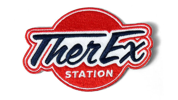
This patch displays a custom-shaped design that demands attention, and its strategic use of color takes boldness to new heights. Against a red circular backdrop, the company logo, "TherEx Station” uses contrasting colors to stand out. “TherEx” is featured in a blue script against a clean white background. Below is the word "Station" in a crisp white font.
The division of the circular area by the logo adds visual interest. Beyond aesthetics, the red background symbolizes the passion and energy driving the company’s mission. The bold blue and pristine white juxtaposition contrasts and harmonizes the overall aesthetic.
This patch is an example of how thoughtful color choices can elevate a design appeal, making it eye-catching and meaningful.
Dimensions School of Dance and Music Patch
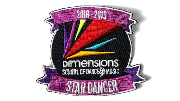
This patch boasts a custom shape that expertly blends bold color combinations into an outstanding mix of contrasting hues. The center of the patches features a black circular design adorned with purple ribbons at the top and bottom.
Against a striking black background, the Dimensions School of Dance and Music logo features an array of bold hues, including pink, yellow, red, blue, and orange. This kaleidoscope of colors stands out boldly against the black backdrop and adds to the visual appeal of the patch. The purple ribbons display "2018-2019" at the top and "Star Dancer" at the bottom, contributing to the patch's narrative.
This patch serves as a stellar example of using contrasting colors to catch the eye and highlight the intricate details of the design.
Hot Wheels Patch
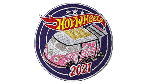
This patch features a circular layout that weaves together an array of colors, elevating its design and injecting a touch of playfulness. At the heart of the design is a Hot Wheels version of a VW bus in an eye-catching pink and white, adorned with white flames and a yellow sunroof.
Above the van, the Hot Wheels logo in red and yellow contrasts the bold colors below. Positioned beneath the van, the bold pink "2021" pops against a complementary blue background, allowing each element to assert its presence.
The patch's thoughtful combination of colors makes key elements stand out, offering a touch of joy and visual appeal. This patch is a prime example of how a well-chosen color palette can transform a design, infusing it with energy and capturing attention with every detail.
Customization Options
Now that we've explored the intricacies of color selection let's take a closer look at other customization options for patches. At Patches4Less.com, we offer a rich palette of colors, allowing you to turn your creative vision into reality. Whether you're drawn to warm hues' vibrancy, cool tones' calmness, or neutrals' versatility, we can help you choose the right colors for your patches.
Navigating the customization process is a seamless and creative endeavor. Our intuitive tools allow you to experiment with different color combinations, ensuring your patch reflects your unique style. From choosing the base color to detailing intricate elements, the customization features empower you to bring your vision to life.
We've explored the language of colors, uncovering the meaning that each hue carries. As you start your patch design, we encourage you to unleash your creativity. Experiment with colors, push the boundaries and let your patch express your unique style and message.
Are you ready to turn your patch dreams into reality? Visit Patches4Less.com and take a look at the customization options waiting for you. Check out our custom patch gallery and be inspired to design something that stands out.
