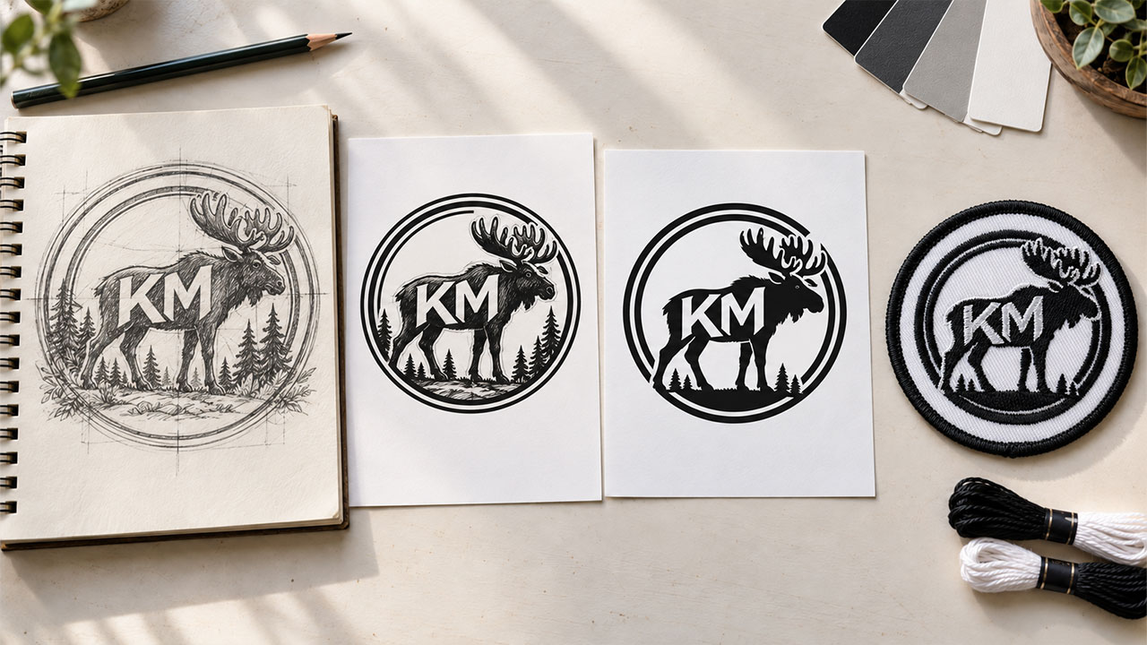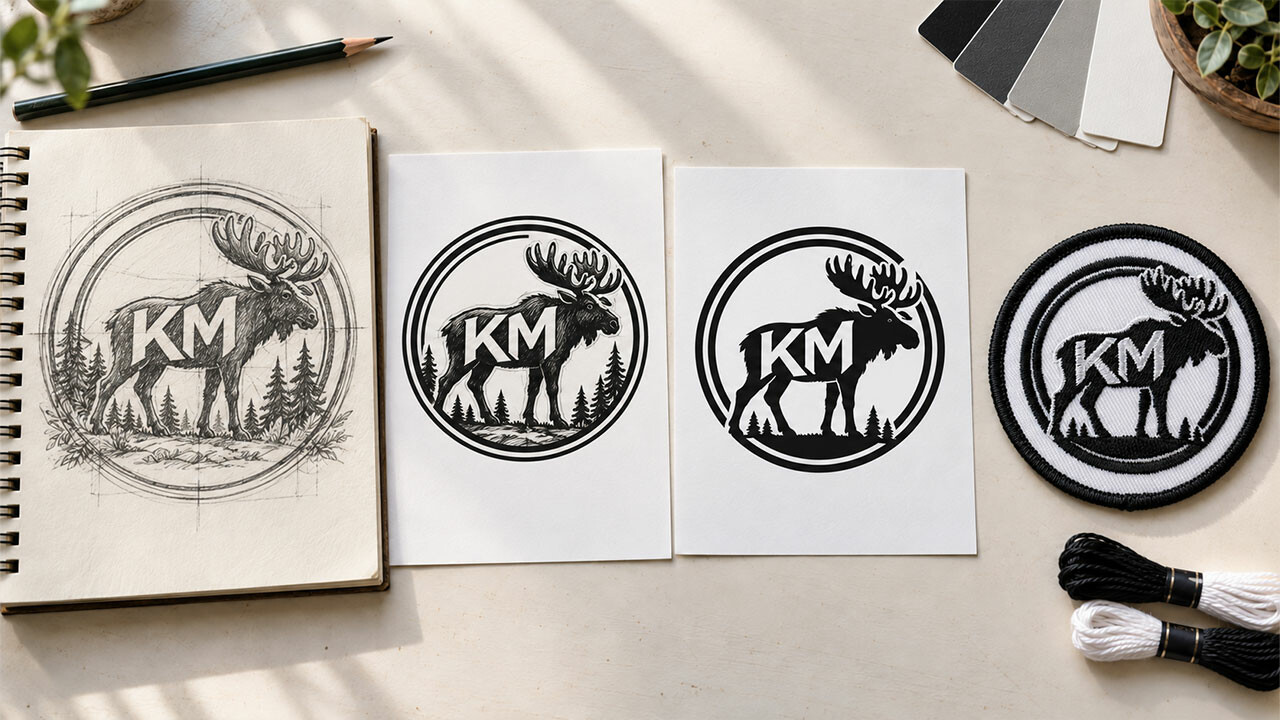

If you’re creating a custom patch design from scratch, you probably have a bunch of ideas you’re eager to try. That’s great! Creativity is the key to any great design.
Especially in the early stages of brainstorming, go wherever your ideas lead. Flights of fancy can lead to really innovative, unique designs. But as you start to narrow down the prospective styles, consider going for a minimalist look.
Minimalism: Less Really Is More
What do we mean by minimalism? It’s not a complicated concept. It means a simple, uncluttered look, one that emphasizes clean lines and functionality, with no unnecessary elements. As noted product designer Dieter Rams once put it, good design is “less, but better.”
Everything Necessary, Nothing More
Let’s consider some examples. What company do you think of when you see a simple red and white bullseye? How about an apple with a bite taken out of it on a white background? A pair of golden arches in the shape of an M?
I guarantee you just named Target, Apple Computer and McDonald’s instantly. That’s how effective minimalist logos can be.
The goal is for your design to be just enough. It’s not about how little you can get away with. It’s about how every single element of your design needs to be there to complete the design, and nothing beyond that.
Elegant Simplicity
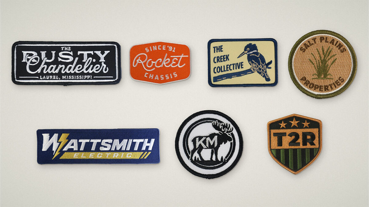
Look around, and you’ll see the minimalist style in lots of places. One of the most effective examples of minimalist logo design I’ve ever seen was on the side of a truck right here in Ocala, Florida. We’re the Horse Capital of the World®, and as a result, we have a lot of companies here that transport horses to and from here every day. The horses might be going to Kentucky, New York, Pennsylvania, California or another state for racing, breeding or simply as beloved companion animals.
I pulled alongside a horse transport truck at a stoplight one day and saw the logo on the truck’s door. It consisted of only seven curved lines, none of them touching another. Yet it perfectly conveyed the outline of a horse. It was a masterpiece of minimalist elegance.
Your design can be equally memorable, even on a patch. Just keep the basic idea of simplicity in mind when crafting your design. The ideal is to have a patch design that people can look at and immediately recognize as your brand.
Creating Your Patch
Start with the most basic idea – what do you want your patch to mean? Is it a way to motivate your teammates? A means to identify your employees to the public? A tribute to a former colleague? The meaning you want people to see in it is the key to a good design.
Next, consider the size of your patch. The bigger the patch, the more room you have for art or text. Bear in mind though, that even larger patches can benefit from a thoughtful use of the available space. One major advantage of a minimalist design is that it can be scaled to any size you want it to be, so you can use it on multiple products.
Don’t Fear the Negative
Remember, negative space is part of your design too. White space is not just empty space. Properly integrated into the design, an area without thread (or ink) can make a powerful statement. It can even feature a separate, related logo within the embroidered segment. It can be a bold look that really helps your design stand out in an eye-catching way.
Elements of Minimalist Design
A successful minimalist style pares every part of your logo or design down to its most basic elements. Simple lines, limited text, often just one or two colors.
While some purists say you can only achieve true minimalism with neutral colors, we would argue there’s nothing wrong with going for a bolder look. Just keep it limited to one or two colors. For example, you could go for a red logo on a full-coverage black background, or a blue logo on a white background. That maintains the minimalist look in a fresh way that can differentiate your brand from your competitors.
Geometric Shapes
An effective minimalist patch sticks with basic, geometric shapes. Once again, simplicity is the key. A clean, uncluttered look makes your logo stand out. That doesn’t mean that you should just have a basic circle, square or triangle and nothing else. You want to add an element that links the shape specifically to your brand.
Fonts Matter Too
Your choice of font for your design is a key factor as well. A distinctive typeface can be the most powerful symbol you can have. Think of the classic Coca-Cola script for example.
Choosing the right font will depend on what you want to convey. A sans-serif typeface such as Helvetica conveys a modern look, well-suited to tech and scientific businesses. A serif font such as Times New Roman on the other hand, conveys a sense of trust and permanence. That can be a more effective choice for traditional industries such as finance or law.

Our Experienced Artists Can Help
If you’re not sure a minimalist design is right for your patch design, or if you don’t yet have a specific design in mind, count on us. Our experienced, talented artists will help you craft a design that’s perfect for your specific patch needs. We understand that one size or style does not fit all. We’ll tailor your patches to look exactly the way you want. Best of all, we don’t charge for artwork or revisions, so you can experiment with your design until it’s just right.
Once you approve your patch design, we’ll manufacture your order, carefully inspect each patch, and deliver the order to your door, usually within 14 to 17 days. We stand behind every item we sell with our 100% Satisfaction Guarantee, so you can be assured your patches will be made right. Should you find any patch you buy from us to be defective in either workmanship or materials, we’ll replace it at no extra charge to you.
When it comes to custom patches, you won’t find better quality, better prices or better customer services than here at Patches4Less.com. If you’d like to find out more, call us at (866) 847-2824, or email us. Let us show you how easy designing and ordering your patches can be, and how great they can look!